The Psychology of Color: Unveiling How Paint Influences Mood, Space, and Energy
Ever wonder why walking into a room painted a certain color just makes you feel… different? It’s not magic, it’s color psychology! Our homes are more than just walls; they’re spaces that shape how we feel and act. The paint on those walls has a surprisingly big say in our mood, our energy, and even how we see the space itself. We're diving into how The Psychology of Color: How Paint Affects Mood, Space, and Energy, and what your choices might be saying about you.
Key Takeaways
- Paint colors directly influence our moods, energy levels, and how we perceive a space.
- Different colors have distinct psychological effects; warm colors tend to energize, while cool colors promote calm.
- Choosing paint colors based on a room's intended use can significantly impact its atmosphere and functionality.
- Our color choices can reflect our personality, lifestyle, and personal values.
- Achieving balance and harmony with color, considering light and personal preference, is key to creating a comfortable and effective living space.
The Science Behind Color and Emotion
Have you ever walked into a room and just felt… different? Maybe it was a cozy, warm feeling, or perhaps a sense of calm washed over you. Chances are, the colors in that space played a big role. It’s not just in your head; there’s actual science behind how colors mess with our moods and how we feel. This field, color psychology, looks at how different shades can nudge our emotions and even change how we act, sometimes without us even realizing it.
Understanding Color Psychology in Home Décor
Think about your home. It’s more than just walls and furniture, right? It’s a place that should feel like you. The colors we pick for our walls aren't just decoration; they’re like silent communicators. They can totally change the vibe of a room, making it feel bigger, smaller, more energetic, or super chill. It’s pretty wild how much impact a simple coat of paint can have. Choosing the right colors can really make a difference in how you feel day-to-day. It’s amazing how colors can truly impact our mood and influence our behavior. For instance, research shows that about 90% of people say color plays a part in their buying decisions, which just goes to show how much these hues affect us emotionally.
The Emotional Impact of Colors
So, what do different colors actually do to us? Well, it’s a mix. Some colors are known for making us feel energized. Others are great for winding down. It’s not always black and white, though. What one person feels from a color might be totally different for someone else, depending on their experiences and culture. For example, while white often means purity in Western cultures, it’s a color of mourning in many Eastern countries. It’s a complex thing, but there are some general trends.
Here’s a quick look at some common associations:
- Red: Often linked to passion, excitement, and sometimes even anger.
- Blue: Frequently associated with calmness, peace, and stability.
- Yellow: Can bring feelings of joy, optimism, and warmth.
- Green: Commonly tied to nature, growth, and a sense of renewal.
- Purple: Sometimes seen as mysterious, luxurious, or creative.
While many color associations seem to have universal qualities, our personal experiences and cultural backgrounds play a huge part in how we individually perceive and react to different colors. It’s a blend of the universal and the deeply personal.
How Colors Influence Our Thoughts and Feelings
It goes beyond just feeling happy or sad. Colors can actually affect how we think and perform. For example, some studies suggest that seeing the color red before a test might actually make you score lower. Weird, right? On the flip side, colors like green have been linked to better performance in certain situations. It’s like the colors are subtly whispering instructions to our brains, influencing everything from our focus to our overall mood. Understanding this connection can help us make smarter choices about the spaces we live and work in, potentially improving our daily lives.
Decoding the Psychological Effects of Popular Hues
Understanding Color Psychology in Home Décor
Ever walked into a room and just felt something different? Chances are, the colors played a big part. Color psychology isn't just for artists or designers; it's a real thing that affects how we feel and act, even in our own homes. Think about it: a bright yellow kitchen might make you feel more awake in the morning, while a deep blue bedroom could help you wind down. It's not magic, it's just how our brains are wired to react to different shades. This field looks at how specific colors can nudge our emotions, change our energy levels, and even influence our thoughts. It's pretty wild how much a simple coat of paint can do.
The Emotional Impact of Colors
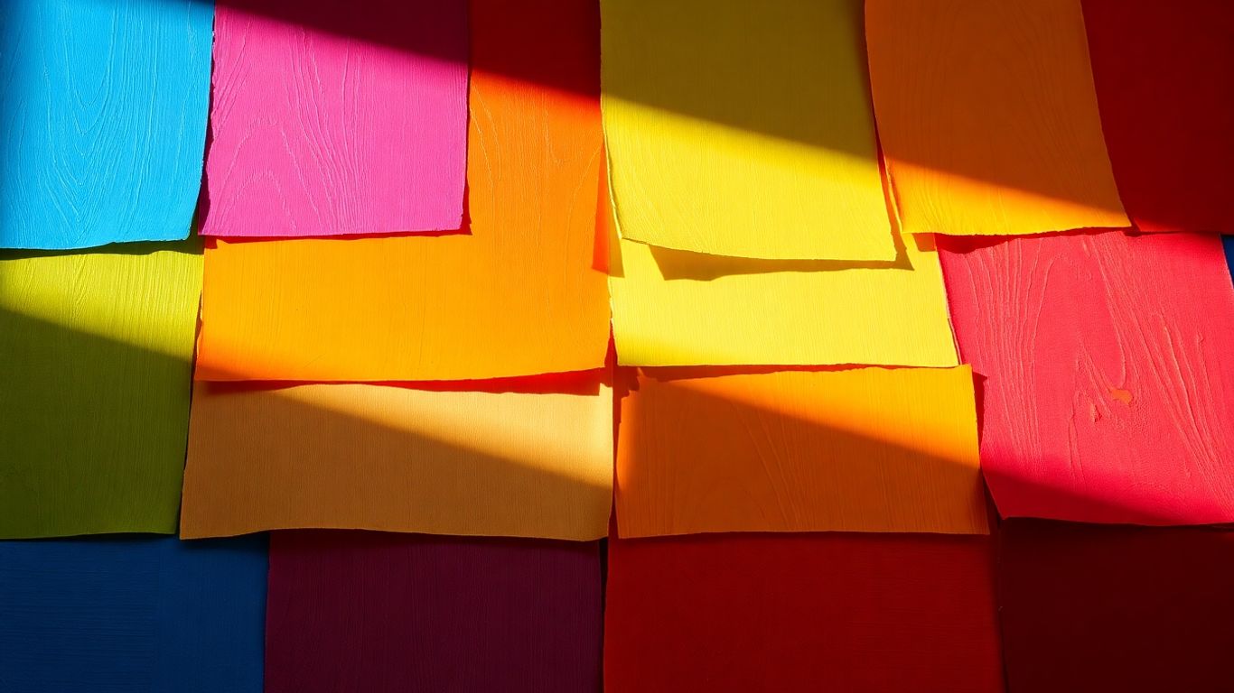
Different colors really do hit us differently. We've got the warm colors – think reds, oranges, and yellows. These guys tend to bring on feelings of energy, warmth, and sometimes even excitement. They can make a space feel more lively and inviting. On the flip side, cool colors like blues, greens, and purples are known for their calming vibes. They can create a sense of peace and tranquility, making them great for spaces where you want to relax. But it's not always straightforward; sometimes red can also signal danger, and too much blue might feel a bit cold or sad.
Here's a quick look at some common associations:
- Red: Passion, energy, excitement, but also anger or warning.
- Blue: Calmness, stability, trust, but also sadness or coldness.
- Yellow: Happiness, optimism, creativity, but also caution or anxiety.
- Green: Nature, growth, harmony, but also envy or inexperience.
- Orange: Enthusiasm, warmth, creativity, but also frustration.
- Purple: Luxury, creativity, mystery, but also arrogance.
How Colors Influence Our Thoughts and Feelings
It's fascinating how colors can subtly steer our thinking. For instance, studies have shown that seeing the color red before a test can actually make people perform worse. It's like a subconscious signal that puts us on edge. On the other hand, green has been linked to feelings of contentment and can sometimes be associated with better performance in certain tasks. It's not just about what we like, but how these hues interact with our minds on a deeper level. Our personal experiences and cultural backgrounds also play a huge role in how we interpret colors, making it a really personal journey.
While there are general trends in how colors affect us, remember that your own history and culture shape your reactions. What feels calming to one person might feel different to another. It's a mix of universal responses and individual experiences.
Tailoring Paint Choices to Room Functionality
Picking the right paint color isn't just about making a room look pretty; it's about making it work for you. Think about what you actually do in each space. The color on the walls can really change how you feel and act in there.
Creating Serene Bedrooms with Calming Palettes
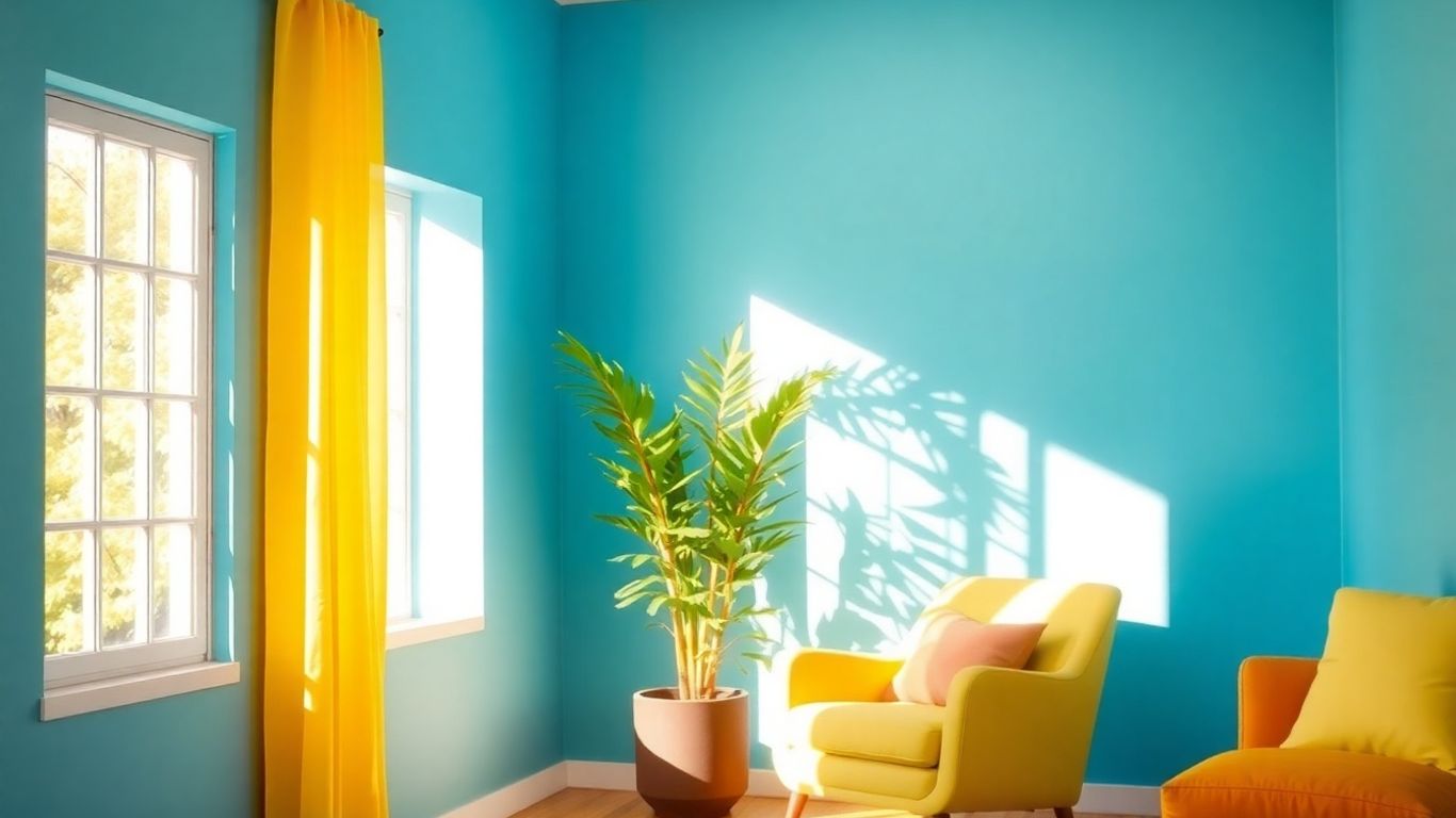
Bedrooms are supposed to be our sanctuaries, right? Places to unwind and get some good sleep. That's why soft, calming colors are usually the way to go. Think about gentle blues, muted greens, or even soft lavenders. These shades tend to slow things down mentally, making it easier to relax. A room painted in a soft blue can feel like a peaceful sky, helping you drift off to sleep more easily. It's not about boring colors, though. Even a pale, dusty rose can feel cozy and safe without being too stimulating. The goal is to create an atmosphere that whispers 'rest' rather than shouts 'wake up!'
Energizing Kitchens and Social Spaces
Now, kitchens and living rooms are a different story. These are often the hubs of activity in a home. For kitchens, you might want colors that feel a bit more lively. Warm yellows can make the space feel sunny and inviting, potentially even making food look more appealing. Reds and oranges, used carefully, can add a spark of energy and encourage conversation. In living rooms, you want a balance – something that feels welcoming for guests but also comfortable for everyday life. A warm neutral with a pop of a brighter accent color, or a balanced green that feels both natural and engaging, can work wonders.
Boosting Focus in Home Offices and Study Areas
When it comes to places where you need to concentrate, like a home office or a study nook, the color choice becomes even more important. Cool colors are often recommended here because they can help promote a sense of calm and clarity. Blues and greens, especially those with a bit more depth like a sage green or a muted teal, can help reduce distractions and keep your mind on task. Avoid anything too bright or jarring that might pull your attention away. It’s about creating an environment that supports sustained mental effort.
The trick is to match the color's vibe to the room's main job. A bedroom needs to feel like a cozy hug, while a home office needs to feel like a quiet, focused zone. It's not just about what looks good on the paint chip; it's about how that color will make you feel and act when you're actually in the room.
Color as a Reflection of Personality
Ever thought about what your walls are saying about you? It’s pretty wild when you stop and consider it. The colors we pick for our homes aren't just random choices; they're like a visual autobiography, broadcasting subtle messages about who we are, what we’re feeling, and even what we secretly want. It’s like your personality is painted right there for everyone to see, and honestly, for yourself to experience every single day.
What Your Wall Colors Say About You
Think of your home as a canvas. The colors you choose are the brushstrokes that tell your story. Are you drawn to bold, energetic reds? That might suggest a passionate, outgoing person who loves to entertain. Or perhaps you lean towards calming blues, hinting at a more introspective and stable nature. Psychologists even suggest that people who prefer blue often exhibit traits like higher conscientiousness and emotional stability, showing a calm and composed outlook [9d48]. It’s fascinating how these hues can hint at our core traits.
Here’s a quick look at what some common color preferences might suggest:
- Reds & Oranges: Often associated with energy, warmth, and sociability. You might be someone who enjoys lively gatherings and isn't afraid to make a statement.
- Blues & Greens: Tend to reflect calmness, stability, and a connection to nature. This could point to a more thoughtful, balanced, or perhaps even analytical personality.
- Yellows & Pinks: Can signify optimism, creativity, and a nurturing spirit. You might be someone who brings joy and comfort to others.
- Neutrals (Grays, Whites, Beiges): Suggest a preference for simplicity, sophistication, or a desire for a versatile backdrop. This can indicate a practical, organized, or perhaps a more minimalist approach to life.
Your home's colors are a powerful tool. They don't just decorate; they actively shape your mood and behavior while revealing your inner self. Choosing colors intentionally can help you create spaces that truly support who you are and who you aspire to become.
Expressing Your Lifestyle Through Hues
Beyond just personality traits, the colors we choose also speak volumes about our lifestyle and how we want to live. A vibrant, energetic kitchen might scream 'foodie' and 'entertainer,' while a serene, muted bedroom whispers 'sanctuary' and 'rest.' The living room, often a social hub, can reflect whether you prefer lively parties or quiet, meaningful conversations. Even your home office color choice can hint at your work style – perhaps a focused blue for analytical tasks or a grounding green for collaborative leadership.
The Personal Connection to Color Perception
It’s important to remember that color perception isn't one-size-fits-all. Your personal history, cultural background, and even your current mood can change how you see a color. What one person finds calming, another might find dull. This personal connection is what makes choosing paint colors such a unique and meaningful part of making a house feel like your own home. It’s about creating a space that not only looks good but feels right to you, reflecting your individual journey and preferences.
Achieving Harmony and Balance with Color
Picking paint colors for your home isn't just about what looks pretty; it's about creating a feeling, a vibe. When you start thinking about how colors work together, you can really make a space feel just right. It’s like putting together a great outfit – you want the pieces to complement each other, not clash.
The Role of Color Harmony in Interior Design
Color harmony is basically the art of putting colors together so they look good and feel good. It’s about creating a visual flow that’s pleasing to the eye and doesn't make you feel overwhelmed. Think about how some rooms just feel instantly calming or energizing – that's often down to good color harmony. It’s not just about picking your favorite shade; it’s about how that shade interacts with the other colors in the room, from the walls to the furniture and even the light.
- Visual Cohesion: Harmony makes a room feel put together, like everything belongs.
- Emotional Comfort: A well-harmonized space tends to feel more relaxing and less jarring.
- Aesthetic Appeal: It simply makes the room look better, more professional, and more inviting.
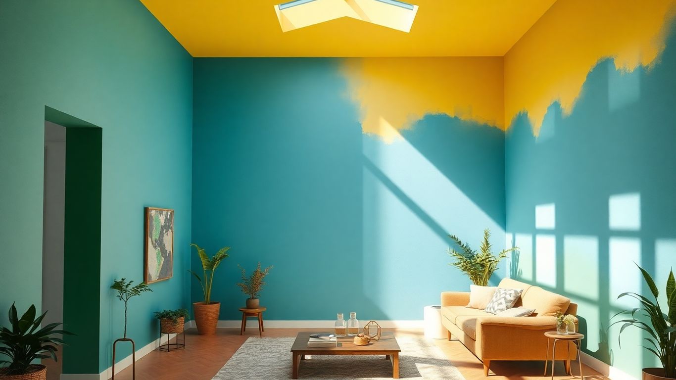
Balancing Warm and Cool Tones
This is where things get interesting. Warm colors like reds, oranges, and yellows bring energy and coziness. They make a space feel more intimate and lively. Cool colors, on the other hand – blues, greens, and purples – tend to create a sense of calm and spaciousness. They can make a room feel more open and serene. The trick to great balance is often mixing them. You don't want a room that's too much of one thing. A living room might have warm, inviting tones, but a touch of cool blue in the decor can keep it from feeling overwhelming. Or, a bedroom might be mostly cool and calming, but a warm accent piece can add a bit of life.
Here’s a simple way to think about it:
| Color Type | Examples | Feeling Evoked |
|---|---|---|
| Warm | Red, Orange, Yellow | Energy, Comfort, Passion |
| Cool | Blue, Green, Purple | Calm, Serenity, Openness |
The goal isn't to eliminate one type of color, but to find a comfortable mix that suits the room's purpose and your personal taste. Too much warmth can feel chaotic, while too much coolness can feel sterile.
The Impact of Lighting on Color Perception
Don't forget about light! The same paint color can look completely different depending on the light. Natural daylight is usually pretty true to color, but it changes throughout the day. Artificial light is a whole other story. Incandescent bulbs tend to cast a warm, yellowish glow, which can make blues look greener and yellows look richer. Fluorescent lights can sometimes have a cooler, bluer cast, making colors appear flatter. LED bulbs vary a lot, so it’s worth checking their color temperature. Always test paint samples in the actual room, at different times of day, and under the lighting you plan to use. What looked perfect in the store might be a surprise on your wall when the evening lights come on.
Strategic Color Use for Well-being and Development
Enhancing Creativity with Specific Hues
Ever feel like you're stuck in a rut, creatively speaking? Sometimes, the answer isn't a new hobby or a change of scenery, but a simple shift in your environment. Certain colors are known to spark imagination and get those innovative juices flowing. Think about incorporating shades of purple and orange into spaces where you brainstorm or work on creative projects. Purple, especially deeper tones, is often linked to imagination and even a touch of luxury, while orange brings warmth and enthusiasm. Together, they can create a dynamic atmosphere that encourages out-of-the-box thinking.
Fostering Better Relationships Through Color
Our living spaces play a big role in how we interact with others. If you're looking to create a more harmonious home environment, consider the colors you use in shared areas. Soft greens and gentle pinks are great for this. Green is associated with balance and renewal, making it feel calming and approachable. Pink, particularly softer shades, can evoke feelings of warmth and comfort. Using these colors in your living room or dining area can help promote a sense of ease and encourage more open, empathetic communication among family and friends.
Improving Sleep Quality with Soothing Shades
Getting a good night's sleep is so important, and your bedroom color choices can actually make a difference. If you're struggling to wind down, try painting your bedroom in cooler, muted tones. Soft blues, gentle greens, or even a very pale, dusty lavender can have a calming effect. These colors are known to help lower stress levels and create a more peaceful atmosphere, signaling to your brain that it's time to relax. It's like giving your nervous system a gentle lullaby.
The colors we surround ourselves with aren't just decorative; they're active participants in our daily lives, subtly influencing our moods, our focus, and even our interactions. Making intentional color choices can transform a house into a sanctuary that actively supports our well-being.
Here's a quick look at how different colors can support specific goals:
- Creativity Boost: Think purple and orange. Use them in your studio or office space.
- Relationship Harmony: Soft greens and pinks work well in living and dining areas.
- Better Sleep: Opt for soft blues, greens, or muted purples in the bedroom.
- Energy & Socializing: Warm oranges and yellows are great for kitchens and gathering spots.
- Focus & Productivity: Blues and greens can help in home offices.
Colors can really change how you feel and help you grow! Picking the right shades can make a space feel calm and happy, or even boost your energy. It's amazing how much a simple color choice can affect your mood and how you learn. Want to learn more about how colors can help you feel your best?
Putting It All Together
So, we've talked a lot about how colors can really change how a room feels, and honestly, how it makes us feel too. It's not just about picking a pretty shade; it's about thinking about what you want that space to do for you. Want to relax? Maybe go for some blues or greens. Need a boost of energy? Yellows and oranges might be the way to go. It's pretty cool how much power these simple paint choices have. Your home is your space, and using color wisely can make it work better for you, whether you're trying to focus, unwind, or just have people over. It’s a simple way to make your home feel more like, well, you.
Frequently Asked Questions
How do colors affect my mood?
Colors can really change how you feel! Bright, warm colors like red and yellow can make you feel more energetic and excited. On the other hand, cool colors like blue and green often make you feel more relaxed and calm. It's like how sunshine can make you happy and a stormy sky can make you feel a bit down.
Can the color of my walls really change how a room feels?
Absolutely! Think of it like this: a bedroom painted a soft blue might feel super peaceful, perfect for sleeping. But a kitchen painted a bright yellow could feel more lively and fun for cooking and hanging out. The color sets the whole mood for the room.
What does my favorite color say about me?
Your color choices can be like a little peek into your personality! If you love bold reds, you might be seen as energetic and outgoing. If you prefer calm blues, people might think you're thoughtful and like peace. It's how your walls can tell a bit of your story.
Are there colors that help me focus better?
Yes! Colors like blue and green are often linked to better focus and concentration. That's why they're great for places where you need to study or get work done, like a home office or a study nook. They help clear your mind.
How do I choose colors that go well together?
It's about finding a balance. You can use colors that are next to each other on a color wheel for a calm look, or colors opposite each other for a more exciting feel. Also, think about how light hits the walls – it can make colors look very different!
Can certain colors help me sleep better?
Definitely. Soft, cool colors like light blues, gentle greens, or muted purples are known to be calming. They can help lower stress and get your body and mind ready for sleep, making your bedroom a more restful place.


Comments
Post a Comment