Beyond the Brush: How Exterior Painters Use Color to Craft Lasting Curb Appeal and Unforgettable First Impressions
When you drive down a street, what makes one house catch your eye? It's often the color. Exterior paint isn't just about protection; it's the first thing people notice and it sets the whole tone for your home. Professional painters know this. They use color like an artist uses a palette, carefully choosing shades that make a house look its best, feel welcoming, and stand out in the neighborhood. It's a big job, and getting it right makes a huge difference.
Key Takeaways
- Color psychology plays a big role in how people feel about a house and even its perceived value.
- Matching paint colors to a home's architectural style makes it look more put-together.
- Using different shades of the same color or strategic accent colors can add interest without being overwhelming.
- Light, shadow, and the surrounding environment all affect how exterior paint colors look.
- A thoughtful exterior paint job creates a strong, positive first impression that lasts.
The Foundation Of First Impressions: Understanding Exterior Color Psychology
Think about the last time you drove down a new street. What made one house just sort of blend in while another one really caught your eye? Chances are, color played a big part. It’s not just about making things look pretty; the colors we choose for the outside of our homes actually send messages before anyone even steps foot inside. It’s like the house is talking to you, and the paint is its voice.
How Color Choices Influence Perceived Home Value
It might sound a little wild, but the color of your house can actually affect what people think it’s worth. Studies and real estate agents often see that certain colors just seem to attract more buyers and can lead to a quicker sale. Think about it: a home painted in a warm, inviting shade might feel more cared for and valuable than one in a jarring or dated color. For instance, a soft greige can make a house look instantly more appealing and photograph well, which is a big deal when people are browsing online. Picking the right shades can really make a difference in how much a home is worth in the eyes of potential buyers. boost a home's resale value.
Creating Welcoming Entryways with Strategic Hues
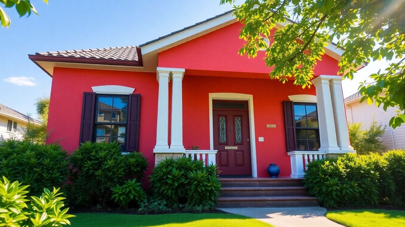
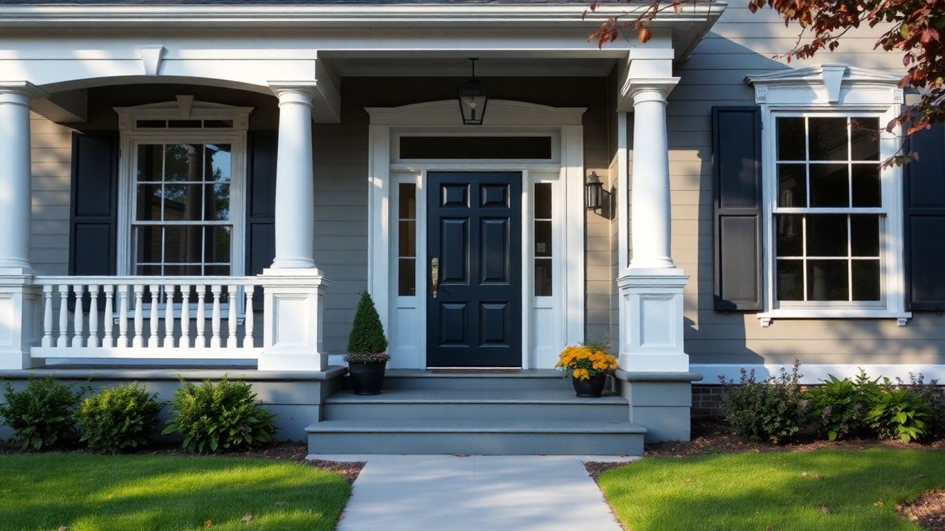
The front door and the area right around it are like the handshake of your house. It’s the very first thing people see up close. Using color here is super important for making people feel invited. A bright, cheerful color on the front door can signal warmth and energy, while a deep, rich tone might suggest elegance and stability. Even the color of the porch or trim around the door can guide the eye and create a sense of anticipation. It’s all about setting a positive tone right from the start, making visitors feel comfortable and eager to see what’s inside.
The Emotional Impact of Exterior Paint Colors
Colors have a way of making us feel things, and that’s true for the outside of our homes too. Blues can bring a sense of calm and reliability, making a house feel like a peaceful retreat. Greens often connect with nature, giving a feeling of freshness and harmony. Reds and oranges can be energetic and bold, making a home stand out and feel lively. Even neutrals, like beiges and grays, have their own emotional weight, often conveying sophistication and a sense of groundedness. The colors you pick can influence not just how your house looks, but how it makes you and your neighbors feel every day.
The psychology of color is a fascinating field, and when applied to exterior painting, it becomes a powerful tool for shaping perceptions. It's about more than just aesthetics; it's about communicating a feeling, a style, and even a sense of value before a single word is spoken.
Beyond Trends: Selecting Timeless Exterior Color Palettes
Picking exterior paint colors can feel like a big decision, and honestly, it is. You want something that looks good now, but also something that won't feel dated in a few years. Forget chasing the latest fad; the real trick is choosing colors that have a lasting appeal. This means looking at palettes that work with your home's architecture and the natural surroundings, rather than against them.
Harmonizing Colors with Architectural Styles
Every house style has its own personality, and the colors you choose should complement it. A Victorian home, with all its nooks and crannies, might look great with a few different shades, while a modern ranch house often benefits from a more streamlined approach. It's about finding colors that highlight the features of the design, not hide them.
- Colonial: Often looks good with classic combinations like white with black shutters, or muted blues and grays.
- Craftsman: Earthy tones, deep greens, and warm browns tend to work well, highlighting the natural materials.
- Modern: Can handle bolder choices or sleek monochromatic schemes, often using grays, whites, and blacks.
- Victorian: Allows for more complex palettes, using multiple colors to emphasize decorative details.
The Enduring Appeal of Neutral and Earthy Tones
Neutrals and earthy colors are popular for a reason: they're incredibly versatile and tend to age gracefully. Think about shades of beige, gray, warm whites, and muted greens or blues. These colors blend well with landscaping and don't typically clash with neighboring homes. They provide a calm, sophisticated backdrop that lets the home's structure and any landscaping take center stage.
Choosing a neutral base color for your home's exterior is like picking a great pair of jeans – it goes with almost everything and rarely goes out of style. It provides a solid foundation that you can then build upon with other elements.
Strategic Use of Accent Colors for Lasting Impact
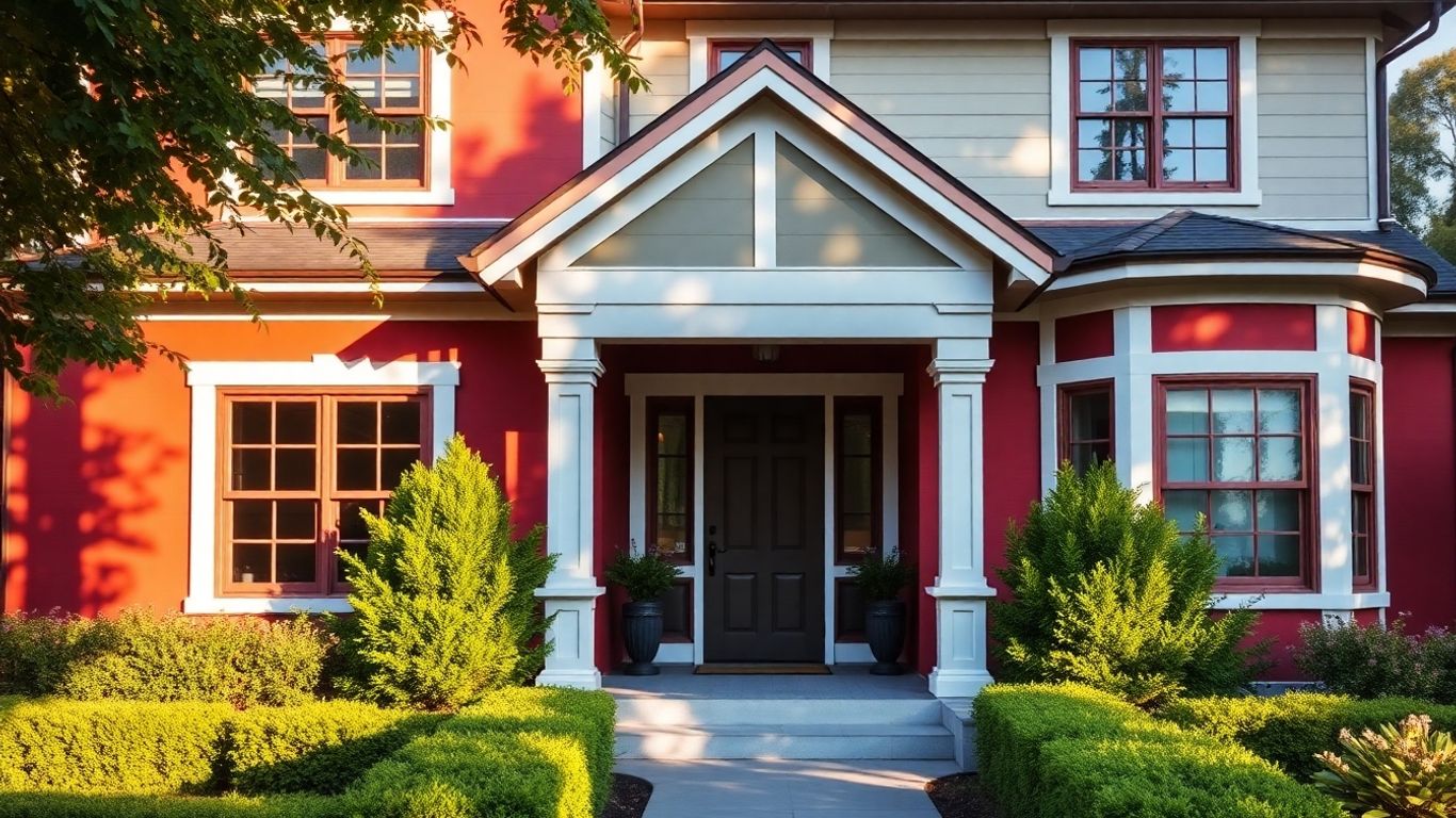
While a neutral main color is often a safe bet, a well-placed accent color can make your home memorable. This is where you can inject a bit of personality. Think about the front door, window trim, or even shutters. A pop of color here can draw the eye and add character without overwhelming the overall look. The key is to use accent colors sparingly to highlight architectural features.
Here are a few ideas for accent colors:
- Front Door: A bright red, a deep teal, or a sunny yellow can create a welcoming focal point.
- Window Trim: Contrasting trim can make windows stand out, especially on a lighter-colored house.
- Shutters: A darker shade of the main color or a complementary hue can add depth.
- Architectural Details: Highlighting gables, corbels, or porch columns with a different color can add visual interest.
Crafting Visual Interest: Advanced Exterior Color Techniques
Sometimes, just picking a single color for your whole house feels a bit… well, basic. You want your home to have a little more personality, right? That's where playing with color combinations and patterns comes in. It’s not just about slapping paint on the walls; it’s about using color strategically to highlight your home’s best features and make it truly memorable.
The Power of Tone-on-Tone Schemes
Think of tone-on-tone as a sophisticated whisper rather than a loud shout. Instead of using drastically different colors, you're working with various shades of the same color family. This approach adds depth and dimension without being overwhelming. For instance, using a deep navy for the body of the house and a slightly lighter, softer navy for the trim can create a subtle, elegant look. It’s a fantastic way to make architectural details pop without resorting to high contrast. This method works wonders on homes with intricate details, allowing them to be appreciated without jarring interruptions. It’s a subtle art, but when done right, it makes a house look incredibly polished.
Bold Statements with Two-Tone Exterior Painting
If tone-on-tone is a whisper, then two-tone painting is a confident statement. This is where you use two distinct colors to define different parts of your home. Often, this involves a primary color for the main body and a contrasting color for trim, shutters, or even a section of the facade. It’s a great way to break up large surfaces or emphasize architectural elements. For example, a classic white house with a bold black roofline and window frames can look incredibly sharp and modern. Or, consider a muted sage green body with a warm, earthy terracotta for the porch and entryway. This technique can completely redefine a home's character, making a plain structure look dynamic and interesting. It’s about creating visual separation and drawing the eye to specific features. You can really enhance your home's curb appeal with these thoughtful combinations.
Geometric Patterns and Architectural Accents
This is where things get really creative. Geometric patterns and the strategic use of accent colors on architectural features can turn an ordinary house into a neighborhood icon. Think about painting the gables in a contrasting color, adding stripes to a porch ceiling, or even using different shades to highlight window surrounds or door frames. This technique is particularly effective on homes with strong architectural lines. It’s about using paint to emphasize the existing structure, almost like drawing with color. You can use these techniques to:
- Define entryways with a pop of color on the door and surrounding trim.
- Highlight unique rooflines or dormers with a complementary shade.
- Create visual interest on large, flat walls with subtle geometric insets or banding.
- Emphasize features like columns or railings with a distinct color.
Using color in these advanced ways isn't just about aesthetics; it's about guiding the viewer's eye and celebrating the home's unique design. It requires a good eye for balance and proportion, but the results can be stunning.
When you start thinking about these more advanced techniques, remember that the goal is to create a cohesive and appealing look. It’s not just about picking colors you like; it’s about how those colors work together and with the home itself. A well-executed color scheme, whether subtle or bold, can make a huge difference in how your home is perceived.
The Painter's Palette: Expert Color Selection for Maximum Appeal
Picking the right paint colors for your home's outside isn't just about making it look pretty. It's a smart move that affects how people see your place, and honestly, how you feel about it too. A good painter knows that the colors they choose can really make a difference, not just for today, but for years down the road. It's about more than just slapping some paint on; it's about understanding how colors work together and with the house itself.
Considering Neighborhood Context and HOA Guidelines
Before you even think about shades of blue or green, take a look around. What are the other houses on your street painted? You don't want your home to stick out like a sore thumb, unless that's the goal, and even then, you need to be careful. Many neighborhoods have Homeowners Association (HOA) rules about exterior colors. These rules are usually there to keep property values up and maintain a certain look for the area. It's always a good idea to check those guidelines first. They often provide a list of approved colors or color families. Ignoring them can lead to having to repaint, which is a hassle nobody wants.
- Check your HOA's official documents for any color restrictions or required palettes.
- Drive around the neighborhood to get a feel for the general color schemes.
- Talk to your neighbors if you're unsure about specific shades.
The Role of Light and Shadow in Color Perception
This is where things get interesting, and where a good painter really shines. The way light hits your house throughout the day, and how shadows play on its surfaces, can totally change how a color looks. A color that looks bright and cheerful in direct sun might look dull or even a bit muddy in the shade. Painters think about this. They might choose a slightly lighter or darker shade than you initially picked, knowing how the natural light will affect it. It's a bit of a science and a bit of an art.
Here's a quick look at how light can change things:
| Color Aspect | Effect in Bright Sun | Effect in Shade |
|---|---|---|
| Hue | Appears lighter, more vibrant | Appears darker, richer |
| Saturation | Can look washed out | Looks more intense |
| Value (Lightness/Darkness) | Seems brighter | Seems deeper |
Understanding how light interacts with color is key. What looks good on a paint chip under store lighting might behave very differently on your home's exterior when exposed to the sun's glare and the evening's shadows. A professional painter accounts for this natural variation.
Achieving a Cohesive Look from Foundation to Roof
Think of your house as a whole picture. The color of the foundation, the main body of the house, the trim, the doors, and even the roof all need to work together. It's not just about the walls. A cohesive look means all these parts feel connected. This often involves picking a main color, a secondary color for trim or accents, and maybe a third color for the front door or shutters. Getting this balance right makes the whole house look put-together and intentional. It’s the difference between a house that looks like it was painted randomly and one that feels thoughtfully designed.
- Foundation: Often a darker, more grounded color that blends with the earth.
- Main Body: The largest area, setting the primary tone.
- Trim: Usually a contrasting or complementary color to define architectural features.
- Accents (Doors, Shutters): A place for a pop of color or a bolder statement.
- Roof: Consider its color when choosing house and trim paints, as it's a significant visual element.
Curb Appeal Starts with Color: Creating First Impressions That Last
Think about the last time you drove down a new street. What made one house just pop, while others sort of blended in? Chances are, color played a big part. It’s not just about slapping some paint on the walls; it’s about making a statement before anyone even steps out of their car. The right exterior color can completely change how people see your home, and honestly, how you feel about it too.
Choosing your home's exterior colors is a bit like picking out an outfit for a big event. You want it to look good, feel right, and make a positive impression. It’s the very first thing visitors notice, and it sets the tone for everything inside. A well-chosen color scheme can make a house feel more inviting, more valuable, and just plain more you.
Here’s a quick look at how color impacts that initial feeling:
- Welcoming Vibes: Lighter, warmer colors often make a home feel more open and friendly. Think soft yellows, creamy whites, or light blues.
- Sophisticated Feel: Deeper, richer tones can give a home a more grounded and elegant appearance. Browns, deep greens, or even a classic navy can do this.
- Modern Edge: Contrasting colors, like a dark body with a bright trim, can give a home a more contemporary look.
- Classic Charm: Muted, natural colors tend to blend well with surroundings and give a timeless appeal.
It’s not just about picking a color you like. You have to think about how it looks in different lights, how it pairs with your roof and landscaping, and even what the neighbors are doing. A little bit of thought goes a long way in making your home stand out for all the right reasons.
The exterior of your home is its handshake with the world. It’s the first hello, the initial greeting that sets expectations. Making this first impression count means choosing colors that not only look good but also reflect the personality and care you put into your home.
So, when you’re ready to paint, don’t just grab the first can you see. Take a moment, consider the impact, and choose colors that will make your home memorable for years to come.
Your home's outside look is the first thing people notice. Picking the right colors can make a big difference, creating a great first impression that sticks around. It's like giving your house a friendly wave hello! Want to make your home stand out with amazing colors? Visit our website to see how we can help.
Wrapping It Up
So, we've talked a lot about how picking the right colors for the outside of your house is a pretty big deal. It's not just about making things look nice for a little while; it's about creating that feeling people get when they first see your place. Whether you're going for something bold that grabs attention or a more subtle look that just feels right, the colors you choose really do make a statement. Think of it as your home's handshake with the world – make it a good one. A well-painted exterior, with colors chosen carefully, can really make your house stand out and feel like home for years to come.
Frequently Asked Questions
How does the color of my house affect what people think of its value?
Colors can make a house seem more expensive or less expensive. Lighter, more classic colors often make a home look grander and more valuable. Darker or very bright colors might make it look smaller or less appealing, potentially lowering its perceived worth. Think of it like dressing up – nice clothes can make someone seem more important.
What are the best colors to make my front door look inviting?
To make your entrance feel warm and welcoming, try colors that stand out but aren't too loud. A friendly red, a cheerful yellow, or a deep, rich blue can draw people in. It's like a smile for your house – it makes visitors feel good as soon as they arrive.
Can certain paint colors make my house feel happier or calmer?
Absolutely! Colors have feelings attached to them. Warm colors like yellows and oranges can feel energetic and happy, while cool colors like blues and greens often create a sense of peace and calm. Choosing colors that match the mood you want for your home is key.
How do I pick colors that look good with my house's style and the neighborhood?
You'll want colors that fit the design of your house, like a modern home might suit sleek colors, while a historic house needs more traditional shades. Also, look at the colors of nearby houses. You don't want yours to clash, but you also want it to have its own charm. It's about fitting in while still looking great.
Are neutral colors always a safe bet for exterior paint?
Yes, neutral and earthy colors like beige, gray, and soft browns are usually a safe and stylish choice. They tend to look good on almost any house style and don't go out of fashion quickly. They provide a calm and solid look that many people appreciate.
When should I use a bright accent color on my house?
Accent colors are best used for small details to add a pop of interest. Think of your front door, window shutters, or trim. A bright color here can make your house stand out and show off its unique features without being overwhelming. It's like adding a cool accessory to an outfit.


Comments
Post a Comment