The Psychology of Color: Interior Painting Secrets to Transform Your Mood and Atmosphere at Home
Ever notice how a room’s color can instantly change how you feel? That’s not just a coincidence. The Psychology of Color: Interior Painting Secrets to Change Mood and Atmosphere isn’t just a fancy idea—it’s real, and it’s something you can use to make your home feel just right. Whether you want a calm bedroom, a lively kitchen, or a cozy living room, picking the right paint can make all the difference. If you’ve ever stood in the paint aisle feeling overwhelmed, don’t worry. This guide will help you understand how colors work on your mood, and give you some simple tips to choose the perfect shades for every room in your home.
Key Takeaways
- Colors in your home have a real impact on your day-to-day mood and energy.
- Warm colors like red, orange, and yellow can make a room feel lively and inviting, while cool shades like blue and green help you relax.
- The best color for each room depends on what you want to feel and do there—think calm for bedrooms, energy for kitchens.
- Lighting and textures can change how paint colors look and feel, so always test before you commit.
- Personal taste matters most—choose colors that make you happy and fit your lifestyle, not just what’s trendy.
Understanding the Science Behind Color Psychology in Interiors
How Our Brains Interpret Color
Let’s start with what really happens when you walk into a room and soak in the color. Light bounces off the walls, your eyes catch it, and your brain gets to work. Your mind instantly tags those colors with feelings and memories—sometimes without you even realizing it. That’s why the same blue that’s calming to one person might remind someone else of a hospital gown. The whole process happens in seconds, and it often shapes your mood before you notice.
Here’s how it works:
- Light enters the eye and hits the retina.
- The retina’s cells pass information along the optic nerve.
- The brain labels the color and links it to emotions or memories.
Color Associations and Emotional Triggers
Colors aren’t just pretty—they tap into feelings and even affect your behavior. Want proof? Think about how you feel in a red-painted room versus a pale green one. That’s no accident! Colors even have reputation for triggering certain emotions:
| Color | Common Emotional Response |
|---|---|
| Red | Energy, hunger, passion |
| Blue | Calm, focus, serenity |
| Yellow | Cheerful, optimistic |
| Green | Balanced, peaceful |
| Purple | Creative, imaginative |
| Orange | Sociable, energetic |
| White | Clean, simple, fresh |
| Black | Bold, dramatic, elegant |
If you want to feel more awake in the morning, a splash of yellow in your kitchen could help. Trying to chill out in your bedroom? Softer greens and blues may do the trick.
Cultural Influences on Color Meanings
Colors can mean very different things depending on where you are in the world—and what you grew up with. For example, white often stands for purity and new beginnings in the West, but it’s linked to mourning in some Eastern traditions. Red is lucky in China, but sometimes seen as aggressive elsewhere.
- Personal experiences shape your color favorites more than you may realize.
- Traditions, holidays, and even flags use color to send clear signals.
- Moving into a new place? What feels welcoming or relaxing to you might not mean the same for someone from a different background.
The colors you choose for your rooms can impact your mood as much as the weather outside, and sometimes even more.
Warm Versus Cool Tones: Creating the Right Atmosphere
Understanding how warm and cool tones work is like knowing which spices to add to a dish: they can totally flip the feeling of a room. Getting the right atmosphere isn’t just about slapping any color on the wall; it’s about figuring out what mood you want for each space and picking colors that back that up.
Energizing Spaces With Warm Hues
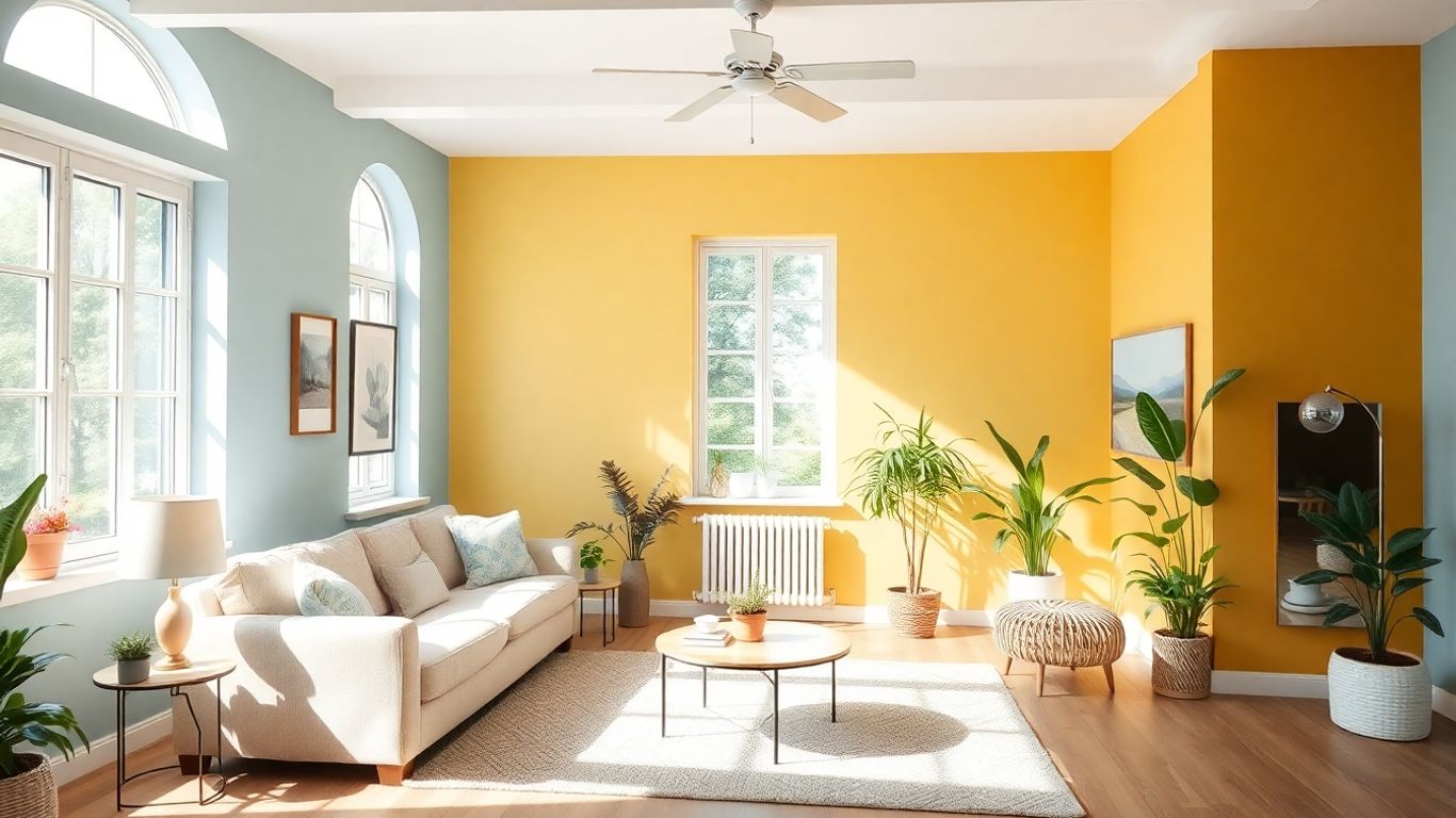
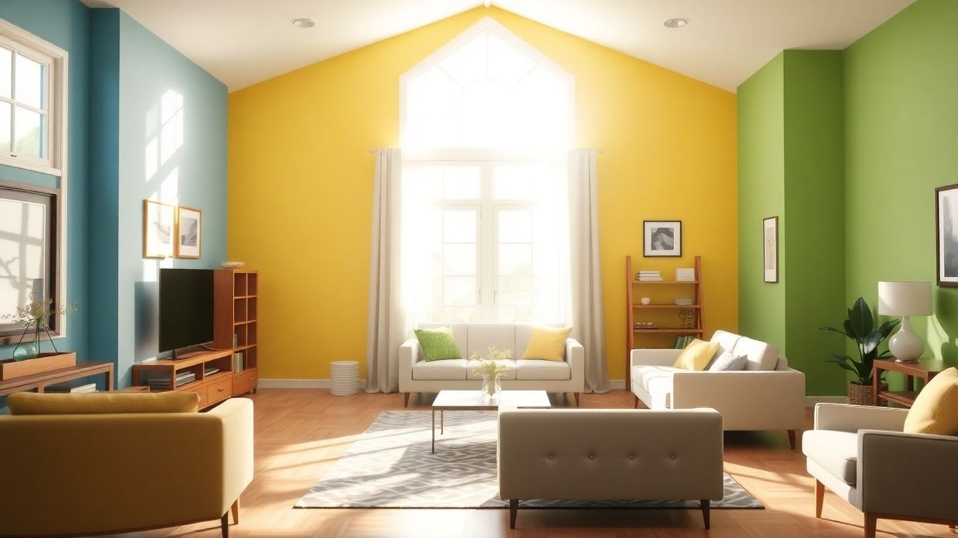
Warm tones like red, orange, and yellow tend to pull you in, making an area feel lively and social. You see a sunny yellow kitchen, and suddenly it feels like a good spot for Sunday pancakes. Reds can hype up a dining room, encouraging conversation and appetite, but they’re often too intense for places where you want to unwind. Oranges hit a good middle ground—they’re energetic but not as loud, especially in more muted forms like terracotta or peach.
Here are a few simple ways to use warm colors:
- Go for an accent wall in a rich color to make a room pop without overwhelming it.
- Even a few warm-toned throw pillows or rugs can make a space feel cozies.
- Use softer, more muted shades for larger spaces if you want the warmth without all the drama.
If your house feels a bit dull or chilly, adding warm colors is one of the fastest tricks to make people feel welcome.
Harnessing Calm With Cool Colors
Cool colors like blue, green, and purple are the ones that tell your brain to chill out. These shades often show up in bedrooms and bathrooms because they reduce stress and make it easier to relax. Light blues and soft greens are especially popular if you want a spa sort of vibe at home. Even deeper tones like navy or forest green can add a sense of quiet without making things look drab.
When picking cool shades, keep these points in mind:
- Lighter cool colors open up small rooms, making them feel bigger.
- Deeper shades work great for creating a cozy, focused nook—try it in an office or reading room.
- Too much of a cool color in a big, empty space can feel a little cold, so balance it out with wood, plants, or warm lighting.
Blue and green are top picks for calming areas because they remind us of the sky and nature—hard to go wrong there.
Balancing With Transitional and Neutral Shades
Not every room needs to lean hard into warm or cool. Neutrals—like white, gray, beige, or taupe—are the peacekeepers. They’re handy if you want your bold furniture or art to stand out, or if you just can’t decide which mood you want. Some neutrals have warm undertones (think cream or tan) while others read cool (bluish gray, for example). The trick is matching the undertone to your goal.
Here's a straightforward table to help you think about some common neutrals:
| Color | Undertone | Mood It Sets | Good For... |
|---|---|---|---|
| Gray | Cool/Warm | Modern, Calm | Offices, Living Rooms |
| Beige | Warm | Cozy, Neutral | Bedrooms, Living Rooms |
| White | Cool/Warm | Airy, Clean | Kitchens, Bathrooms |
| Taupe | Warm | Cozy, Classic | Entryways, Dining Areas |
- Use warm neutrals where you want a snug, lived-in feel.
- Cool neutrals give off a crisp, modern vibe.
- Mix in a little wood or a couple of plants to keep things grounded.
A well-chosen neutral is like owning the perfect pair of jeans—it goes with everything and never feels out of place.
Room-by-Room Secrets for Mood and Atmosphere
The living room is where most of us gather, relax, or host friends. Colors here can set the tone for your entire home. If you want a room that feels welcoming but flexible, try neutrals like beige, greige, or a subtle taupe. Deep greens or navy as accents can make the space feel richer, while earthy tones like clay or olive add warmth. For those who love color but don’t want to go overboard, consider painting just one wall or adding color through accessories like pillows or rugs.
- Neutrals = flexible and calming backdrop
- Earthy tones = warmth and coziness
- Deep greens/navy = sophistication, works well for accent pieces
Pick colors you genuinely enjoy seeing every day, even if they aren’t trending.
Soothing Palettes for Bedrooms and Retreats
This is your restful zone, so cool, calming colors work best. Soft blues, pale greens, or gentle lavenders make it easier to wind down at night. If you prefer warmer colors, muted peach or sandy beiges have a cozy feel without being too stimulating. Avoid super-bright reds or neons—they're more likely to keep you up than help you relax.
Here's a quick look at bedroom color impact:
| Color Family | Mood Effect |
|---|---|
| Light blue | Relaxing, serene |
| Sage or mint green | Refreshing, restful |
| Lavender | Calming, gentle |
| Warm beige | Cozy, soft |
Productivity and Focus in Home Offices
Your home office needs to strike a balance between peaceful and energizing. Light blues and greens support concentration and keep stress down. If you want a spark of motivation, add touches of yellow or orange in your décor, like a chair or wall art. Stick with fairly light paint colors as darker shades can sometimes feel heavy and distracting if you’re working all day.
Three practical choices for focus:
- Powder blue walls for steady concentration
- Olive or moss green for long, calm work sessions
- Subtle yellow or orange accents to fight off sluggishness
Uplifting Choices for Kitchens and Dining Areas
Kitchens often become the heart of homes. Yellows and soft oranges can make the space feel happy and lively, even on dreary days. White is also classic and fresh, great for making smaller kitchens feel open and uncluttered. If you want a bolder look, try deep navy, teal, or emerald green—especially as an accent color for cabinets or a feature wall.
- Warm hues (yellow, coral): energizing, appetite-boosting
- White or cream: clean, spacious, open
- Greens/teals: fresh and unique, ideal for modern kitchens
In spaces where you spend a lot of time, don’t be afraid to experiment—just test a sample in your light first. The right shade can really lift your mood and make daily routines more enjoyable.
Transforming Your Mood With Intentional Color Choices
You may not realize it, but the colors on your walls can really change how you feel day to day. Picking paint isn’t just about matching your couch or showing off your favorite shade—it’s also about setting the right mood for how you actually want to live.
Reducing Stress With Serene Tones
If your home feels chaotic, you might benefit from bringing in calmer shades. Soft blues and gentle greens can help take the edge off and create a restful space. Pale grays, muted beiges, or even some gentle lavenders also work. These colors act almost like a visual deep breath, especially in bedrooms or any spot you use for unwinding.
- Try sky blue or a powdery green in bedrooms.
- Use soft gray for living rooms where you want to decompress after a long day.
- For a meditation space or reading nook, pale lavender can offer quiet calm without feeling cold.
Choosing peaceful colors helps your mind and body feel at ease after busy or stressful days. The effect might be subtle at first, but over time, you’ll notice yourself relaxing a little faster just by being surrounded by calming hues.
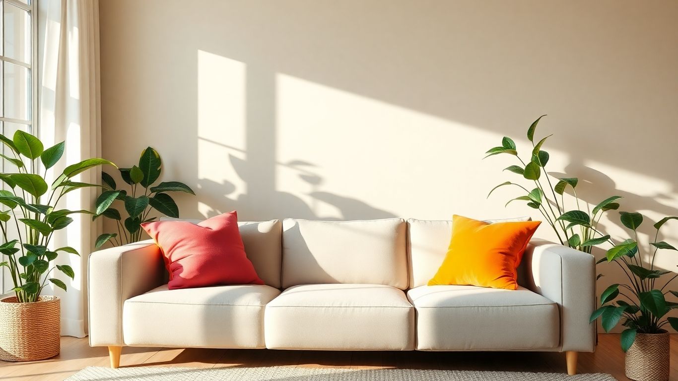
Boosting Creativity With Vibrant Accents
Sometimes you want your space to energize you. Little pops of bold color—think yellow, orange, coral, or even jewel tones—can give your creativity a jumpstart. These aren’t always colors you want to drench the whole room in, but used thoughtfully, they zap your mind awake.
- Paint a single wall or small area with a sunny yellow or bright teal for creative spaces.
- Bring in energetic colors through pillows, artwork, or shelving if you worry about going overboard.
- Accent trims or doors with coral or magenta to keep things playful but not overwhelming.
Here’s a quick look at what certain vibrant hues can help spark:
| Color | Positive Effect |
|---|---|
| Yellow | Encourages optimism |
| Orange | Promotes enthusiasm |
| Magenta | Sparks imagination |
| Turquoise | Stimulates clear thinking |
Improving Sleep Quality Through Calming Colors
If sleep isn’t coming easy, you might want to rethink your wall color (and not just your bedtime routine). Soft, cool shades—like light blue, sage green, or subdued neutrals—are best for supporting healthy sleep. These colors don’t stimulate your mind at night, helping you wind down.
- Blues signal to your brain that it’s time for rest, thanks to their association with calming skies and water.
- Greens, especially those inspired by nature, encourage a sense of safety and recovery.
- Avoid strong reds or bright whites, since these can make your space feel too lively for truly restful sleep.
You spend a third of your life sleeping, so painting with sleep in mind makes sense. Even if you love bright colors elsewhere, consider keeping your bedroom a soothing retreat.
Lighting, Texture, and Color: The Ultimate Interior Trio
Creating a space that feels right goes way beyond just picking a paint color. Lighting, texture, and color all work together, and if you get them in sync, your rooms start to feel completely different. One small change can shift the whole mood.
How Lighting Alters Paint Perception
Lighting is one of the biggest reasons why paint looks different in your home than in the store. Morning sun, afternoon shadows, even your choice of bulbs—each affects how we see color.
- Sunlight from the south brings out warm tones; north light makes colors feel cooler.
- Soft, yellow bulbs can make whites look creamier and tone down bright colors.
- LED lights with higher brightness can make blues and greens more vivid.
| Light Source | Color Effect |
|---|---|
| North-facing | Cooler, softer colors |
| South-facing | Warmer, bright colors |
| Incandescent | Richer, yellow tones |
| LED/Cool Bulbs | Crisper, blue tones |
Testing a paint swatch at different times of day helps you avoid surprises once the whole room is painted.
Using Texture to Enhance Color Effects
How a surface feels changes how a color appears. Texture can add interest or soothe you, depending on what you’re after:
- Rough or matte walls spread light, making colors look more muted.
- Glossy finishes reflect more, so the color pops and feels bolder.
- Textured materials (like woven rugs or wooden planks) can break up strong color and make a space feel relaxed.
A rough brick accent wall, for example, makes a deep red more inviting than a high-gloss version.
Pairing Color With Furniture and Décor
Paint is only part of the picture. If you want your space to feel put together, think about what surrounds your walls too.
- Match big furniture pieces for a subtle look, or let one piece (like a teal couch) stand out against a softer wall.
- Use rugs and pillows to tie together wall colors and furniture, adding balance.
- Keep the space from looking busy by choosing one or two bold tones, then use neutrals elsewhere.
Getting color, light, and texture to work together isn’t about perfection—it’s about what feels comfortable every time you walk through the door.
Expert Interior Painting Tips for Lasting Impact
Painting your home can seem like just another weekend chore, but getting it right makes all the difference.
Testing Colors Before You Commit
Don't just trust the paint chip—test before taking the plunge.
- Sample multiple shades on different walls to see how each looks in various lighting.
- Check the paint in the morning, afternoon, and at night—sometimes, one color feels totally different as the day goes on.
- Live with the samples for a few days. What feels fresh at first might get old fast, or maybe another grows on you.
| Time of Day | Paint Color Appearance |
|---|---|
| Morning | Cooler, more muted |
| Afternoon | Warmer, brighter |
| Night | Deeper, more intense |
Sampling paint in its real setting saves you from expensive, time-consuming do-overs down the line.
Importance of Paint Finish and Sheen
The finish you choose changes how color and light interact on your walls. Each finish comes with its own pros and cons:
- Matte/Eggshell: Hides wall flaws, but harder to clean. Good for living rooms or bedrooms.
- Satin: Slight shine, wipes clean easily. Great for hallways, family rooms.
- Semi-gloss/Gloss: Super easy to wipe down, but highlights every bump. Best for kitchens, bathrooms, and trim.
| Finish Type | Best Rooms | Highlights |
|---|---|---|
| Matte | Bedrooms, Ceilings | Hides flaws |
| Eggshell | Living Rooms | Subtle sheen |
| Satin | Hallways, Family Rms | Easy cleaning |
| Semi-gloss | Kitchens, Baths, Trim | Very washable |
| Gloss | Trim, Doors | Shiny, durable |
Small Touches That Make a Big Difference
It’s tempting to focus just on the walls, but the details are what finish the whole look:
- Paint doors and trim in a crisp white, or choose a bold contrast for more personality.
- Use accent walls for pops of color without overwhelming the space.
- Don’t forget ceilings—sometimes a soft color overhead adds coziness or drama.
Even if you’re painting a small spot, a careful edge or neatly painted trim can make the entire room look more put together.
Small decisions—like which finish you pick or whether you test a few colors—can save you headaches and disappointment. Stay patient, pay attention to those little touches, and you’ll end up with a space you’re proud to come home to every day.
Common Mistakes to Avoid When Using Color Psychology at Home
When it comes to painting your home, it’s pretty easy to get caught up in the excitement of bold colors or the promise of a perfectly curated Pinterest-worthy space. But, honestly, there are some missteps that can completely throw off the vibe (and your sanity). Let’s talk about the most common mistakes I see—and how you can sidestep them.
Overwhelming Spaces With Intense Colors
Sure, a deep red dining room or a navy bedroom can look amazing in magazines, but when you go all-in on saturated or dark shades, it can feel heavy and even claustrophobic. Here are a few things people overlook:
- Painting all four walls with a deep or overly bright color
- Not balancing bold hues with softer ones or neutral furniture
- Ignoring how small or dimly-lit rooms make strong colors even more overpowering
A little goes a long way with vibrant colors. Try an accent wall or use accessories—think pillows, throws, or artwork—to bring in those energizing shades, rather than coating every inch.
Ignoring Flow Between Connected Rooms
Color doesn’t exist in a vacuum—especially in open floor plans or spaces with open doorways. Mixing a cool gray living room with a shockingly orange kitchen next door might sound creative, but walking through your home can end up feeling disjointed or even a bit unsettling.
Try these tips for better flow:
- Carry a common color or undertone from room to room
- Use similar saturations or intensity levels for adjacent areas
- Keep transitions soft by repeating at least one element (like trim color or a neutral)
| Room Connection | Smooth Flow | Potential Clash |
|---|---|---|
| Living/Kitchen | Soft beige + pale blue | Gray + loud orange |
| Bed/Hallway | Muted lavender + white | Teal + brick red |
Neglecting Personal Preferences and Lifestyle
It’s easy to get caught up in trends or well-meaning advice from friends. But what’s the point if you end up with a color that stresses you out, feels like an office building, or gets dirty five minutes after painting?
- Don’t choose a color you dislike just because it’s “in” right now
- Keep lifestyle in mind—kids, pets, and daily routines can ruin pristine white walls in days
- Consider how often you use a space and whether you want it to energize, relax, or inspire you
At the end of the day, the best paint color is the one that feels right for you—forget what’s trending and focus on what actually makes you happy in your space.
So next time you’re ready to reach for those paint chips, take a step back and remember: thoughtful, intentional choices are always better than following a color trend blindly. Your home (and your mood) will thank you.
If you're thinking about using color psychology to design your home, make sure to sidestep some frequent slip-ups. Picking colors that don’t match your space, following popular trends blindly, or forgetting your own style can lead to results you won’t enjoy. Want to learn more tips and get expert painting help? Visit our site and see how we at John Melendez Paint Company can make your home look its best!
Conclusion
So, that’s the scoop on how color can totally change the mood and feel of your home. It’s kind of wild to think a simple paint job can make you feel more relaxed, focused, or even happier in your own space. Picking the right colors isn’t always easy, but it’s worth taking your time and thinking about how you want each room to feel. Don’t be afraid to try something new—sometimes the colors you least expect end up being your favorites. At the end of the day, your home should be a place that feels good to you. Grab some paint samples, test them out, and have fun with it. Your walls are a blank canvas, so make them work for you and your mood!
Frequently Asked Questions
How do colors in my home affect how I feel?
Colors can change your mood and energy. For example, cool colors like blue and green help you feel calm and relaxed, while warm colors like red and yellow can make you feel more awake and excited.
What are the best colors for a bedroom if I want to sleep better?
Soft, cool shades like light blue, gentle green, or soft gray are great for bedrooms. These colors help you relax and make falling asleep easier.
Can I use bright colors in small rooms?
Yes, you can! Bright colors can make a small room feel cheerful and lively. Just use them in small amounts, like on one wall or with decorations, so the room doesn’t feel too busy.
How do I pick the right paint color before actually painting?
Try out paint samples on your walls and look at them at different times of day. Light changes how colors look, so this helps you see what you really like before painting the whole room.
Is it okay to use the same color in every room?
You can use the same color if you love it, but mixing colors makes your home more interesting. Try using different shades of your favorite color to keep things looking fresh but still matching.
What should I do if I pick a color and don’t like it?
Don’t worry! You can always repaint. Start with a small area or use decorations in a new color to see if you like it better before painting the whole room.


Comments
Post a Comment