Interior Painting That Tells a Story: Unlocking Lifestyle and Personality Through Color Choices
Ever walk into a room and just feel... right? That's the magic of picking the right paint colors. It's more than just slapping some color on a wall; it's about telling your story. Interior painting that tells a story: how color choices reflect lifestyle and personality is all about making your home feel like *you*. Think about how colors make you feel – happy, calm, energized? Your home should do that too. We'll explore how to pick shades that not only look good but also speak to who you are and how you live.
Key Takeaways
- Colors have a real impact on how you feel in a space, so choose wisely to set the right mood.
- Creating a master color plan helps your whole house feel connected and intentional, even if rooms have different shades.
- Don't just follow trends; pick colors that truly match your personal style and how you use your home.
- Using accent colors can add interest and highlight what you love, but use them thoughtfully.
- Always test paint samples in your actual space and lighting before you commit to a color.
The Emotional Resonance Of Interior Painting
Ever walk into a room and just feel something different? That's the magic of paint color at work. It's not just about making walls look pretty; it's about how those colors make us feel, day in and day out. Think of your home as a living, breathing space that should support how you want to feel. The shades you choose can really set the stage for everything that happens within those walls.
Colors That Influence Mood And Well-Being
Colors have a surprising amount of power over our emotions. It's why certain shades are used in hospitals (calming blues and greens) or why fast-food places might use bright, energetic reds. Our brains are wired to react to color in specific ways. For instance, warm colors like yellows and oranges can bring a sense of cheerfulness and energy, making a space feel more inviting and lively. On the flip side, cool colors such as blues and purples often bring a sense of calm and tranquility, perfect for bedrooms or spaces where you want to unwind. Even subtle shifts in shade can change the feeling dramatically.
Here's a quick look at how some common colors might affect you:
- Blues: Can promote feelings of peace and serenity, good for relaxation.
- Greens: Often associated with nature, they can create a balanced and refreshing atmosphere.
- Yellows: Bring warmth and optimism, can make a space feel brighter.
- Reds: Stimulating and energetic, can create excitement but use sparingly.
- Neutrals (Grays, Beiges): Provide a stable, sophisticated backdrop, allowing other elements to shine.
Setting The Atmosphere With Hue Choices
Beyond individual moods, the overall palette you select dictates the entire vibe of your home. Are you aiming for a cozy, rustic cabin feel, or a sleek, modern loft? The colors you pick are the primary tools for achieving this. A deep, moody charcoal can make a living room feel intimate and sophisticated, while a light, airy sage green can make a kitchen feel open and clean. It’s about creating a consistent feeling that flows through your home, making each room contribute to a larger narrative.
The colors on your walls are more than just decoration; they are silent storytellers, shaping the emotional landscape of your home and influencing your daily experiences in ways you might not even realize.
Transforming Spaces Through Color Psychology
Color psychology in interior design isn't about rigid rules, but rather understanding general tendencies. For example, using lighter, cooler tones can make a small room feel larger and more open. Conversely, darker, warmer colors can make a large, cavernous room feel more intimate and cozy. This strategic use of color can physically alter our perception of a space, making it more functional and comfortable for its intended purpose. It’s a way to subtly guide how people interact with and feel within a room, turning a simple paint job into a thoughtful design choice.
Crafting A Cohesive Color Story For Your Home
Ever walk into a home and just feel like everything flows? Like each room has its own personality, but they all somehow belong together? That's the magic of a cohesive color story. It’s about making your whole house feel like one unified, thoughtful space, rather than a collection of separate rooms.
Establishing a Master Color Plan
Think of this as your home's design blueprint. Before you even pick up a paintbrush, it's smart to have a general idea of the colors you want to use throughout your house. This doesn't mean every room has to be the same color, not at all! It's more about picking a core palette – maybe three to five colors – that will appear in different ways in different spaces. This plan acts as your guide, making future decorating and even furniture shopping much simpler. You can keep it as simple as a folder with paint swatches or as detailed as a Pinterest board.
Harmonizing Colors Across Connecting Rooms
When rooms flow into each other, especially in open-plan layouts, color harmony is key. You want colors that talk to each other nicely. A great way to do this is to pick a main color for a space and then use a lighter or darker shade of that same color in an adjoining room. For instance, a deep teal in the living room could transition into a softer, muted teal in the dining area. This creates a visual link without being repetitive. Another trick is to pick colors from the same family – like different blues or greens – that have similar undertones, whether warm or cool, to keep the flow going.
Considering Sightlines for Seamless Transitions
What do you see when you look from one room into another? Those views are called sightlines. When planning your colors, take a moment to stand in the middle of a room and do a full spin. Notice which walls or doorways are visible from where you're standing. The colors in those visible areas should complement the room you're in. Hallways and entryways are perfect spots for colors that bridge the gap between rooms. A neutral color that shares undertones with the rooms it connects can work wonders here, creating a smooth, almost invisible transition.
A well-thought-out color plan makes decorating easier down the line. It helps you make choices that fit the overall vibe you're going for, preventing those "oops, that doesn't quite match" moments.
Choosing Your Palette: Where Style Meets Personality
Picking the right colors for your home is more than just picking shades you like; it's about creating a space that feels like you. It's where your personal style and how you live your life really come together on the walls. Think about it – your home is your sanctuary, and the colors you choose play a huge part in how it feels.
Balancing Trends With Personal Preferences
Trends come and go, and while they can be fun for inspiration, they shouldn't be the only thing guiding your paint choices. Your home should feel authentic to you, not like a showroom that's trying too hard to be current. What looks great in a magazine might not actually make you happy day-to-day. It's more important to pick colors that you genuinely love and that make you feel comfortable and content. Consider what colors have always drawn you in, or what hues make you feel a certain way. Maybe a soft blue always brings you a sense of calm, or a warm yellow makes you feel energized. These personal connections are far more valuable than any fleeting trend.
Reflecting Your Unique Lifestyle Through Color
How do you actually live? Are you someone who loves hosting big gatherings, or do you prefer quiet nights in? Do you work from home and need a space that sparks creativity, or is your home a peaceful retreat from a busy world? Your lifestyle should absolutely influence your color choices. For instance, a family with young kids might want more durable, forgiving colors, perhaps in a slightly darker or richer tone, while someone who works from home might opt for colors known to boost focus and productivity, like certain shades of green or blue. The goal is to make your walls support and enhance your daily life.
Here’s a quick look at how different lifestyles might lean:
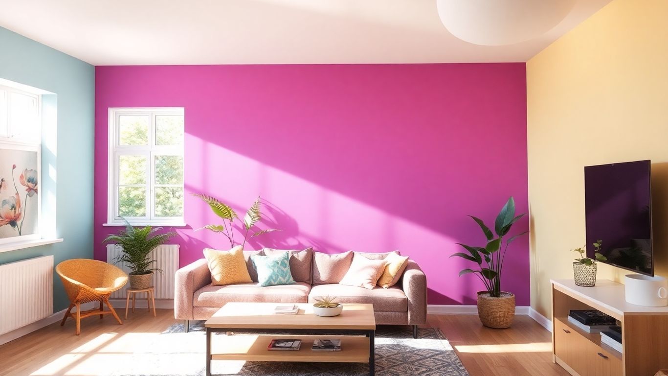
- The Entertainer: Might lean towards warm, inviting colors like terracotta, deep reds, or rich golds to create a welcoming atmosphere for guests. They might also use bolder accent colors to make a statement.
- The Homebody/Relaxer: Often prefers calming, serene colors such as soft blues, muted greens, or gentle grays. These hues promote a sense of peace and tranquility.
- The Creative Professional: Could benefit from colors that stimulate the mind, like vibrant blues, energetic oranges, or even sophisticated purples. These can help foster innovation and focus.
- The Family Hub: Needs practical yet cheerful colors. Think about mid-tone blues, greens, or even warm neutrals that can hide minor scuffs and create a lively, yet grounded, environment.
Incorporating Cherished Elements Into Your Design
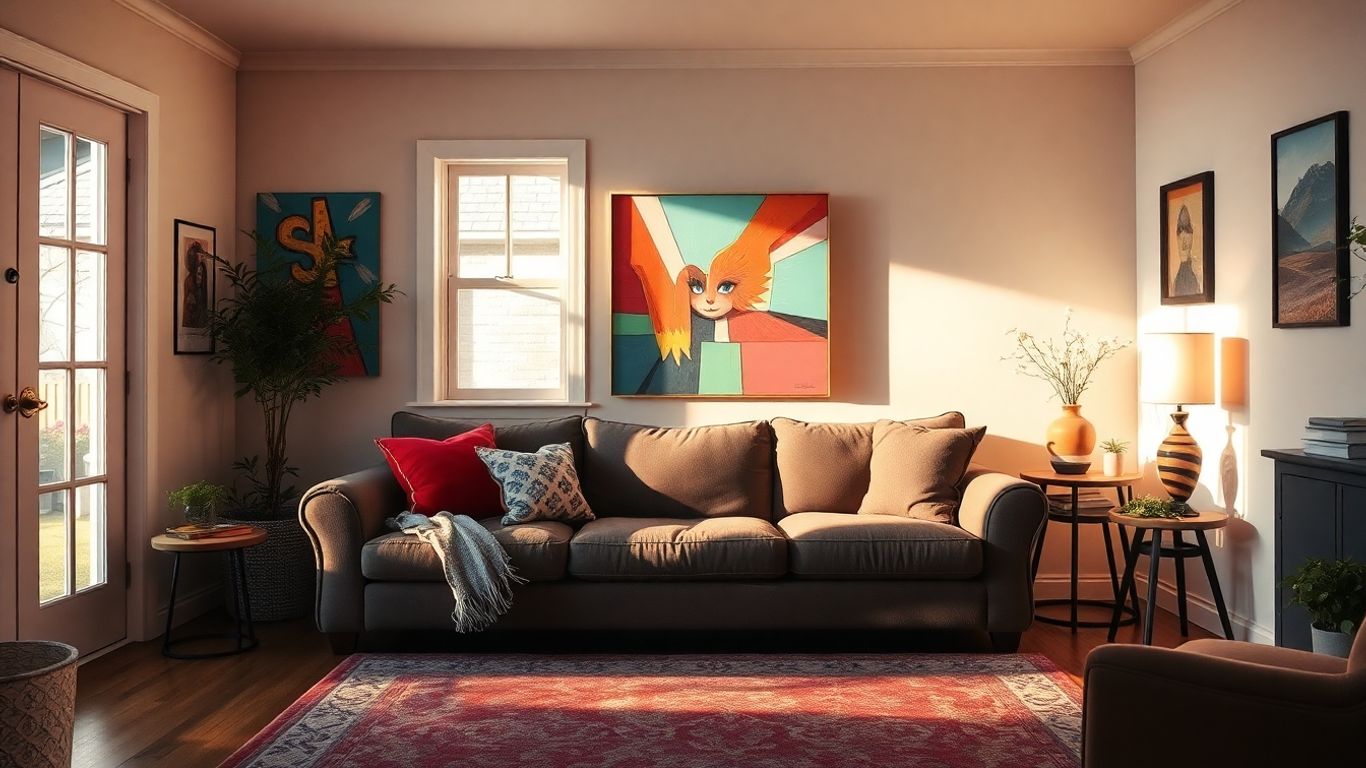
Don't forget about the things you already love! Your home is a collection of your experiences and memories. That favorite armchair, a piece of art you picked up on vacation, or even a sentimental rug can be a fantastic starting point for your color palette. Look at the colors within these cherished items. Do you see a beautiful deep blue in a painting? That could be your main wall color. Is there a warm, earthy tone in your favorite throw blanket? That could inspire your accent pieces. Using these existing elements helps tie everything together naturally, making your space feel cohesive and deeply personal. It’s about building a color story that’s already woven into the fabric of your life.
When you're choosing colors, think about the feeling you want to create. Do you want a room to feel energetic and lively, or calm and restful? The colors you pick will directly influence that mood. It's like setting the stage for whatever activities you'll be doing in that space.
The Art Of Color Harmony And Balance
Getting your colors to play nicely together is where the magic really happens. It’s not just about picking shades you like; it’s about making them work in concert to create a feeling in your home. Think of it like a band – you need different instruments to create a full sound, and in your home, different colors create a full visual experience.
Exploring Different Color Schemes
There are a few classic ways to put colors together that tend to work well. You've probably heard of some of these:
- Monochromatic: This is using different shades, tints, and tones of just one color. It’s super calming and can make a room feel bigger. Think a soft sage green with a deeper forest green.
- Analogous: This involves picking colors that are next to each other on the color wheel, like blues and greens, or yellows and oranges. They flow really nicely into each other.
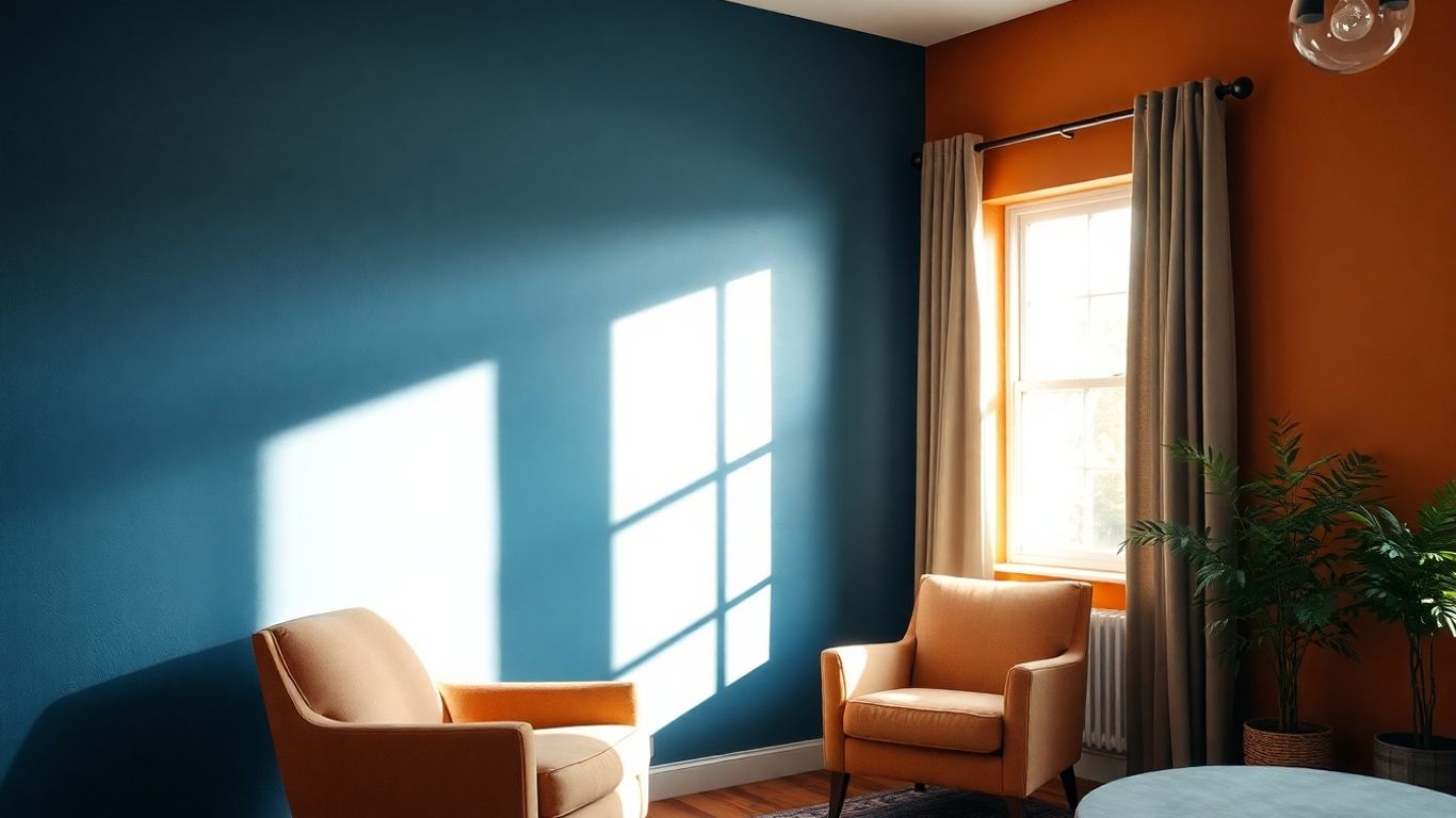
- Complementary: This is where you pair colors that are directly opposite each other on the color wheel, like blue and orange, or red and green. This creates a really strong contrast and makes both colors pop. It’s bold and energetic.
- Triadic: This uses three colors that are evenly spaced around the color wheel, like red, yellow, and blue. It’s a bit more complex but can be very lively.
Achieving Visual Appeal Through Color Interaction
How colors interact is fascinating. A bright yellow next to a deep navy can make the yellow seem even brighter. Or, a soft grey can make a vibrant teal feel more grounded. It’s all about how they sit next to each other. You want to avoid having one color completely shout over the others unless that’s your specific goal for an accent. The goal is a balanced conversation between the hues.
When you're looking at paint chips, try to imagine them on a large wall, not just a tiny square. What looks good in a small sample might be too much when it covers your whole room. It's a common mistake, and testing is key.
Creating An Inviting And Cohesive Environment
Ultimately, the point of harmony is to make your home feel like a place you want to be. When colors work together, the whole space feels more put-together and peaceful. It’s like a well-composed song – everything fits. This doesn't mean every room has to be the same color, but there should be a thread connecting them, a sense that they belong to the same home. This thoughtful arrangement makes your house feel more like a sanctuary.
Strategic Use Of Accent Colors
Adding Depth and Visual Interest
Think of accent colors as the exclamation points in your home's design narrative. They're not meant to dominate, but rather to draw the eye and add a spark of personality. Without them, a room can sometimes feel a little too safe, a bit bland even. A well-placed accent can transform a space from ordinary to unforgettable. It’s about creating moments of visual excitement that break up larger areas of color and add layers to your design.
Highlighting Focal Points With Pops Of Color
Accent colors are your best friend when you want to draw attention to specific features. Maybe you have a stunning piece of art, a unique architectural detail, or a favorite armchair. Using an accent color on or around these elements makes them stand out. It’s like putting a spotlight on what you love most in the room. This technique helps guide the viewer's eye and creates a sense of intentionality in your decor.
Here are a few ideas for using accent colors:
- Furniture: A single accent chair in a bold hue can anchor a seating area.
- Decor: Throw pillows, rugs, or curtains in a contrasting color can liven up a neutral sofa or room.
- Architectural Features: Painting a fireplace mantel, a built-in bookshelf, or even an interior door in an accent color can add unexpected charm.
- Artwork: Frame a piece of art with a mat or frame that picks up on your accent color.
Sparking Conversation With Thoughtful Accents
Beyond just looking good, accent colors can tell a story about you. Choosing a vibrant, unexpected accent color might show your adventurous side, while a softer, richer tone could reflect a more sophisticated taste. These small touches are often what people notice and comment on, making your home feel more personal and lived-in. They are the details that make guests ask, "Where did you find that?" or "I love that color!"
When selecting accent colors, it's helpful to pull from your main color palette but choose a shade that offers a distinct contrast. This ensures that while it pops, it still feels connected to the overall scheme. Think of it as a supporting character that gets a moment in the spotlight, rather than a completely different play.
Consider these common accent color strategies:
- Complementary Colors: Pairing colors opposite each other on the color wheel (like blue and orange) creates high contrast and energy.
- Analogous Colors: Using colors next to each other on the wheel but in a more saturated or lighter/darker shade can provide a subtle yet effective accent.
- Monochromatic Variations: Even within a single color family, a significantly lighter or darker shade can act as an accent, adding depth without introducing a new hue.
Testing And Refining Your Color Selections
So, you've picked out some colors that you think will work. That's great! But before you go buying gallons of paint, let's talk about actually testing them out. It might seem like a small step, but honestly, it makes a huge difference. Colors can look totally different on a chip than they do on your actual walls, especially when the light changes throughout the day.
The Importance Of Sampling Paint
Think of paint samples as a dress rehearsal for your walls. You wouldn't buy a whole outfit without trying it on first, right? The same goes for paint. Getting small sample pots and painting swatches on your walls is the best way to see how a color truly behaves in your home. It's not just about the color itself, but how it interacts with your furniture, your flooring, and the overall vibe of the room. This is where you can really start to see your home's color story come to life, or realize that a color you loved online just isn't working in person.
Observing Colors In Different Lighting Conditions
This is where things get interesting. That soft blue you picked might look amazing in the morning sun, but then turn a bit gray and gloomy in the evening. Or maybe a warm beige looks perfect at noon but washes out completely after sunset. You need to see how your chosen colors perform under all sorts of light:
- Morning Light: Often cooler and brighter.
- Afternoon Light: Usually warmer and more direct.
- Evening Light: Can be dimmer and influenced by artificial lighting.
- Artificial Light: Different bulbs (incandescent, LED, fluorescent) cast different tones.
Take a look at your swatches at different times of the day and night. Snap some photos on your phone, too, to see how they look in different settings. This step is non-negotiable if you want to avoid a paint job you regret.
Ensuring The Desired Effect Before Commitment
Ultimately, testing is about making sure the paint color does what you want it to do. Do you want a cozy bedroom? A vibrant kitchen? A calm living space? The color needs to support that feeling. If your samples aren't hitting the mark, don't be afraid to go back to the drawing board. It's much easier and cheaper to change a sample pot than to repaint an entire room. Remember, this is about creating a space that feels right for you, and taking the time to test your colors is a big part of getting it perfect.
Sometimes, a color might look great on one wall but not another, especially if one wall gets a lot more natural light than the other. Pay attention to these differences. It's all part of understanding how the color will live in your space.
Seeking Expert Guidance For Your Vision
Sometimes, even with the best intentions and a clear idea of what you like, the sheer number of paint chips and color combinations can feel overwhelming. That's where bringing in a professional can really make a difference. Think of them as your personal color sherpa, guiding you through the mountain of choices to find the perfect summit.
The Role Of Interior Designers And Color Consultants
Interior designers and color consultants are folks who do this for a living. They've got a trained eye for how colors play off each other, how light affects them throughout the day, and how they can impact the feel of a room. They don't just pick pretty colors; they understand the psychology behind them and how they can align with your lifestyle. They help translate your vague feelings about a space into a concrete color plan. It's not just about picking a shade of blue; it's about choosing the right shade of blue that makes your living room feel calm and inviting, or a vibrant yellow that energizes your kitchen.
Finding Professionals To Bring Your Ideas To Life
So, how do you find these color wizards? Start with recommendations from friends or family who've had good experiences. Online directories for interior designers and color consultants are also a great resource. Don't be afraid to look at portfolios online to see if their style matches what you're hoping for. When you connect with a potential professional, have a chat about your project. Ask about their process, their fees, and what kind of results you can expect. It's like dating, but for your house – you want to make sure you're a good fit!
Tailored Advice For Your Unique Space
What's great about working with an expert is that their advice is specific to you and your home. They'll consider things like the amount of natural light your rooms get, the existing furniture you plan to keep, and the overall architectural style of your house. They can help you avoid common pitfalls, like choosing a color that looks fantastic in the store but turns muddy on your walls under your home's specific lighting. They can also help you create that cohesive flow between rooms we talked about earlier, making sure your whole home tells a unified story.
Working with a professional isn't about giving up control; it's about collaborating with someone who has the knowledge to help you achieve your vision more effectively and avoid costly mistakes. They can help you see possibilities you might have missed on your own.
Got a big idea for your home or business? Don't guess what to do next. Our team is here to help you figure out the best way to make your vision a reality. We offer expert advice to guide you through every step. Visit our website today to learn more and get started!
Painting Your Story
So, picking out paint colors for your home isn't just about making things look pretty. It's really about showing who you are. Think about the vibe you want – calm, energetic, cozy? The colors you choose set that mood. Don't be afraid to mix things up a bit, maybe add a pop of something unexpected here and there. And if it all feels a bit much, talking to a designer can really help sort things out. Ultimately, your home should feel like you, a place that tells your own story, one wall at a time.
Frequently Asked Questions
How do I pick the best colors for my rooms?
Think about the style you already have and the mood you want to create. Also, notice how natural light hits your walls at different times of the day. Picking colors that go with these things will help make your space feel just right.
What colors make a small room feel bigger?
Generally, lighter colors make rooms seem more open and spacious. Think about soft blues, greens, or even light grays. However, don't be afraid to use darker colors if that's the cozy vibe you're going for!
How can I use accent colors without making my room too busy?
Accent colors are great for drawing attention to something special, like a cool piece of art or a comfy armchair. Use them on just one or two things in the room, like throw pillows or a vase, to add a pop of interest without overwhelming the space.
Is it better to follow paint color trends or my own taste?
It's totally up to you! Trends can give you fun ideas, but the most important thing is that you love your space. Choose colors that show off who you are and make you feel happy and comfortable.
How can I make sure colors look good from one room to the next?
Try to use a main set of colors throughout your home. You can use different shades of these colors in different rooms, or pick colors that are next to each other on the color wheel. This helps everything feel connected and flow nicely.
When should I get help from a professional painter or designer?
If you're feeling stuck or unsure about choosing colors, a professional can be a huge help. They know a lot about color and design and can give you ideas that fit your home and your style perfectly.


Comments
Post a Comment